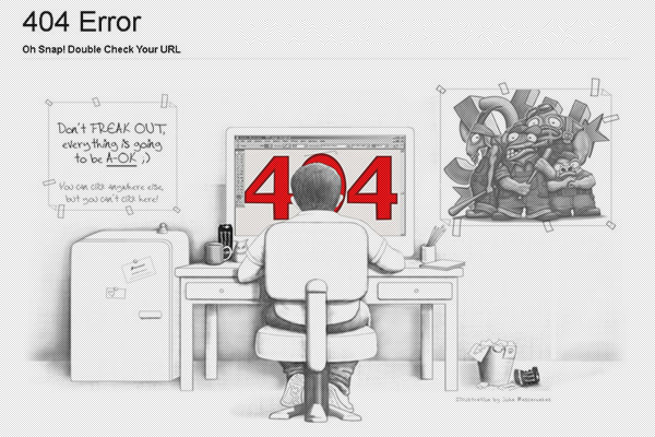
考研英语二-图表作文写作方法和模板--非常全-有作用.doc

上传人:hw****26 文档编号:2283179 上传时间:2019-05-05 格式:DOC 页数:40 大小:220.50KB
下载 相关 举报
考研英语二-图表作文写作方法和模板--非常全-有作用.doc_第1页
第1页 / 共40页
考研英语二-图表作文写作方法和模板--非常全-有作用.doc_第2页
第2页 / 共40页
考研英语二-图表作文写作方法和模板--非常全-有作用.doc_第3页
第3页 / 共40页
考研英语二-图表作文写作方法和模板--非常全-有作用.doc_第4页
第4页 / 共40页
考研英语二-图表作文写作方法和模板--非常全-有作用.doc_第5页
第5页 / 共40页
点击查看更多>>
资源描述

1、1考研英语二_ 图表作文写作方法和模板图表作文(一)第一节 图表作文的类型图表作文可分为两大类:表作文和图作文。表作文表格(Table)可以使大量数据系统化,便于阅读、比较。表格常由标题(Title)、表头(Boxhead)(表格的第一行 )、侧目(Stub)(表格左边的第一列)和主体(Body) 部分(表格的其余部分)等部分组成。如下表:用表格表达的信息具体准确,而且表格中的各项均按一定规律排列。阅读表格时要注意找出表格中各个项目的相互关系,表格中各个项目的变化规律。例如,上面的表格中的数字说明,和 1978 年相比,1983 年大学入学的人数在增加,而小学的入学人数在减少。搞清楚这些变化规

2、律也就读懂了表格的内容。图作文图作文又可分为三种:圆形图作文、曲线图作文和条状图作文。(1) 圆形图作文圆形图(Pie chart)也称为饼状图或圆面分割图。圆形图因为比较形象和直观,各部分空间大小差别容易分辨,所以常用来表示总量和各分量之间的百分比关系。整个圆表示总量,楔形块表示分量。有时圆形图还有数值表,两者结合可把各分量表示得更准确、清楚。例如:This is a pie chart of the average weekly expenditure of a family in Great 2Britain. As can be see from the chart, the main

3、 expenditure of an average British family is spent on food, which accounts for 25% of its total expenditure. The next two significant expending items are transport and housing, which are 15% and 12% respectively. If we take into account clothing and footwear, which makes up 10%, the four essentials

4、of life, that is, food, transport, housing, and clothing and footwear, amount to 62% of the total expenditure.(2) 曲线图作文曲线图(Line graph)也称为线性图或坐标图。曲线图最适合表示两个变量之间关系的发展过程和趋势。一般来说,曲线所呈现的形状比某一点所代表的变量的值更有意义。曲线图有横轴和纵轴。一般先看横轴所代表的数量或时间等,然后再看纵轴所显示的意义。同时必须找出线条所反映的最高或最低的变化。例如:这个曲线图的横轴代表 1990 年的不同的月份,纵轴代表交通事故的数量。

5、从交通事故曲线图上可知,前八个月的交通事故的数量有升有降。曲线图在八月份升到了最高点(39),此后一直呈下降的趋势,十二月份降到了最低点(16)。可见, 1990 年的交通事故的数量总体上呈下降的趋势。(3) 条形图作文条形图(Bar graph)也称为立柱图或圆柱图。条形图由宽度相同但长度不同的条块代表不同的量。当要比较几个项目或量时,常用不同颜色来区分。条形图主要用来表示:1)同一项目在不同时间的量;2)同一时间不同项目的量。阅读条形图时,要先看图例,再看横轴、纵横各代表什么量,每一个刻度所代表的值是多少,最后找出图中各长条所表示的数据及各长条间的相互关系。例如:左边的条形图的横轴代表时间

6、,纵轴代表期望寿命(Life Expectancy),这一条形图想3要体现的是同一项目(期望寿命)在不同时间的量。右边的条形图的横轴也是代表时间,纵轴是代表婴儿的死亡率(Infant Mortality),这一条形图想要体现的也是同一项目(婴儿的死亡率)在不同时间的量。左边的条形图表明 1990 年的人均期望寿命比 1960 年的人均期望寿命长 20 岁,而 1990 年的婴儿死亡率比 1960 年的婴儿死亡率下降了 50%。第二节 图表作文的出题形式例 1 题目:Changes in Peoples Diet Study the following table carefully and y

7、our composition must be based on the information given in the table. Write three paragraphs to :1. state the changes in peoples diet (饮食) in the past five years;2. give possible reasons for the changes;3. draw your own conclusions.You should quote as few figures as possible.例 2 题目:Car Accidents Decl

8、ining in Walton City Remember that your composition must be written according to the following outline;1. Rise and fall of the rate of car accidents as indicated by the graph;2. Possible reason(s) for the decline of car accidents in the city;3. Your predictions of what will happen this year.Your com

9、position should be no less than 120 words and you should quote as few figures as possible.4例 3 For this part, you are allowed 30 minutes to write a composition on the topic Health Gain in Developing Countries. Your composition must be no less than 120 words and you should base your composition on th

10、e following instructions (given in Chinese):1. 以下图为依据描述发展中国家的期望寿命(life expectancy)和婴儿死亡率(infant mortality)的变化情况2. 说明引起变化的各种原因从以上例子可见,图表作文一般在题目中给出作文的标题和一个或几个统计表格、圆形图、曲线图或条形图,有时还用英文或中文提纲的形式给出提示,要求我们:1)用文字描述图表,客观解释图表中所传递的信息,并找出某种规律或趋势;2)就图表中所反映的某种趋势或问题分析其原因或后果。第三节 图表作文的写作要领图表作文着重说明事实,常常是通过对图表中所反映的具体数据的

11、说明、分析、比较,对某种事物或现象的事实或变化情况等加以说明,并提出结论或看法。因此,图表作文常常采用议论文体的写作方法。写好图表作文,关键在于能否读懂图表中所提供的信息,把握各信息间的联系,用准确流畅的语言把这一信息表达出来,并就这一信息发表自己的看法。图表作文的写作步骤写图表作文时,要注意遵循以下步骤:1)认真分析图表的含义,弄清图表中所含的信息及不同信息间的关系;52)确定文章的主题思想,构思出文章的基本框架,筛选出能说明图表主题思想的典型数据;3)编列文章的提纲;4)根据文章的提纲,将各段的提纲内容扩展成段落,然后将各个段落组成文章,注意段与段之间的衔接与过渡;5)检查与修改。图表作文

12、的篇章结构写图表作文时,常采用三段式的谋篇方式。文章的第一段往往分析图表中的数据变化反映什么问题或趋势,概述图表所揭示的信息。第二段分析造成这一问题或趋势的原因。第三段则展望未来的情况或提出解决问题的办法或建议。这一结构可以简单地表述为:第一段:概述图表反映的主题思想第二段:分析产生的原因第三段:展望未来或提出方法或建议图表作文常用的句型(1)常用的开篇句型( 即概述图表内容时常用的表达法) According to the table/pie chart/line graph/bar graph, we can see/conclude that 根据该表/图,我们可知 The table/

13、graph reveals (shows/indicates/illustrates/ represents/points out) that 该表/图表明6 As we can see from the table As can be seen from the line/bar graph As is shown (illustrated/indicated) in the pie chart 如表/图所示,(2) 描述增减变化常用的句型 Compared with is still increased by The number of grew/rose from to An incre

14、ase is shown in ; then came a sharp increase of In the number remains the same/drops to There was a very slight (small/slow/gradual) rise/increase in 1990. There was a very steady (marked/sharp/rapid/sudden/ dramatic) drop (decrease/ decline/ fall/ reduction) in 1998/ compared with that of last year

15、).下面是根据例 2 的题目要求写的范文。From the graph, we can see that the number of car accidents in Walton city fluctuated during the year of 1990. The first two months of 1990 showed an increasing trend. The rate rose to 32 in March but fell to 26 in June. From June on, the rate was rising again and reached the pe

16、ak point 39 in August. After August the rate began to decline remarkably, and eventually dropped to the lowest point 16 at the end of the year. Therefore, its obvious that car accident 7in Walton city declined in 1990.主题句/ 概述表格反映的内容(5) 反映交通事故的变化情况(6) 小结:总结表格数据反映的总趋势There are several reasons for the

17、decline. First, a new traffic law was made and came into force. It provided that in summer every car must be air-conditioned. As a result, the highest rate in August, when humidity and high temperature make drivers impatient and easily lead to car accidents, dropped steadily. Second, new roads were

18、built and some narrow streets were widened, which quickened the flow of traffic. Finally, the city administration made great efforts to heighten peoples awareness of observing traffic rules.主题句原因/措施一解释措施一/次要辅助采取措施一后的结果原因/措施二原因/ 措施三With all these new measures, Im sure the rate of car accidents in Wal

19、ton city will go on falling this year.总结:展望未来的情况第四节、 图表作文练习及其参考范文下面是写作练习,在写作的过程中注意审题,考虑文章的结构、采用的扩展方法、开头的结尾的方法以及文章中的过渡等。练习 1:Directions: For this part, you are allowed thirty minutes to write a composition of no less than 120 words on Changes in Peoples Diet. Study the following table carefully and y

20、our composition must be based on the information given in the table. Write three paragraphs to:1. state the changes in peoples diet (饮食) in the past five years;2. give possible reasons for the changes;83. draw your own conclusions.You should quote as few figures as possible.As is shown in the table,

21、 there have been great changes in peoples diet between 1986 and 1990. From the table, we can find that grain, formerly the main food of most Chinese people, is now playing a less important role in peoples diet. And the same goes for fruit and vegetables. On the other hand, the consumption of high-nu

22、trition food such milk and meat has increased rapidly.What has caused these changes? There are mainly three reasons (主题句). (6) First, people are much wealthier than before. (7) With higher income, they can afford to buy nutritious foods. (8) Second, people have realized the importance of a balanced

23、diet to their health. (9) Lack of certain amount of meat or milk, for example, will result in poor health. (10) Finally, owing to the economic reform, meat and milk, which were scarce in the past, are produced in large quantities.(11) Although milk and meat are important to ones health, eating too m

24、uch rich food may result in obesity and may other diseases. (12)Therefore, people should not only eat a lot of milk and meat, but also enough grain, fruit and vegetable for the sake of their health.图表作文(二)一、图表作文写作常识1、图形种类及概述法:9泛指一份数据图表:a data graph/chart/diagram/illustration/table饼图:pie chart直方图或柱形图

25、:bar chart / histogram趋势曲线图:line chart / curve diagram表格图:table流程图或过程图:flow chart / sequence diagram程序图:processing/procedures diagram2、常用的描述用法The table/chart diagram/graph shows (that)According to the table/chart diagram/graphAs (is) shown in the table/chart diagram/graphAs can be seen from the tabl

26、e/chart/diagram/graph/figures,figures/statistics shows (that)It can be seen from the figures/statisticsWe can see from the figures/statisticsIt is clear from the figures/statisticsIt is apparent from the figures/statisticstable/chart/diagram/graph figures (that) table/chart/diagram/graph shows/descr

27、ibes/illustrates how3、图表中的数据(Data )具体表达法数据(Data)在某一个时间段固定不变:fixed in time在一系列的时间段中转变:changes over time10持续变化的 data 在不同情况下:增加:increase / raise / rise / go up 减少:decrease / grow down / drop / fall 波动:fluctuate / rebound / undulate / wave 稳定:remain stable / stabilize / level off 最常用的两种表达法:动词+ 副词形式( Ver

28、b+Adverb form)形容词+ 名词形式( Adjective+Noun form)二、相关常用词组1、主章开头图表类型:table 、chart、diagramgraph、 column chart、pie graph描述:show、describe 、illustrate 、can be seen from、 clear、apparent、reveal 、represent内容:figure 、statistic、number、percentage、proportion2、表示数据变化的单词或者词组rapid/rapidly 迅速的,飞快的,险峻的dramatic/dramatically 戏剧性的,生动的significant/significantly 有意义的,重大的,重要的sharp/sharply 锐利的,明显的,急剧的steep/steeply 急剧升降的steady/steadily 稳固的,坚定不移的

展开阅读全文
相关资源
相关搜索

当前位置:首页 > 教育教学资料库 > 精品笔记

Copyright © 2018-2021 Wenke99.com All rights reserved

工信部备案号浙ICP备20026746号-2  

公安局备案号:浙公网安备33038302330469号

本站为C2C交文档易平台,即用户上传的文档直接卖给下载用户,本站只是网络服务中间平台,所有原创文档下载所得归上传人所有,若您发现上传作品侵犯了您的权利,请立刻联系网站客服并提供证据,平台将在3个工作日内予以改正。